BYD unveils new brand identity for group, passenger vehicle unit
BYD Company Limited “BYD”) on Feb. 17 announced the launch of new brand design for both the group and its passenger vehicle business “BYD Auto”).

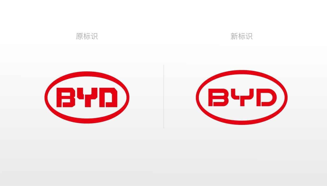
Left: the former logo for BYD Group; right: the newest one; photo credit: BYD
Compared to the former logo for BYD Group, the newly-unveiled one still uses red to color the enclosed ellipse and the letters “BYD”, while the letters are in a sleeker shape, which is interpreted as a design delivering the sense of amicability and openness.

BYD said the new logo design resulted from “a perfect combination of technological and humanistic aesthetics”, highlighting BYD's “human-centered” value and aspiration to solve social problems by using technologies.
Through 27-year endeavors, BYD has made significant headway in the innovation of sustainable development with four enclosed industrial chains dedicated to electronics, automobiles, rail transit, and new energy, respectively) formed. The ellipse of the new logo represents BYD's global vision and idea of sustainable development.
The new brand logo will be applied in the group's electronics, new energy and rail transit businesses as well as several sectors of the automobile business including the commercial vehicle and fork-lift truck arms).

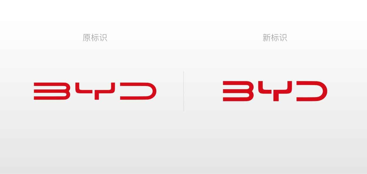
Left: the former logo for BYD Auto; right: the newest one; photo credit: BYD
Meanwhile, the brand identity of BYD Auto was upgraded as well. Notably, brands like Denza also have a unique logo.

